

Hey there!
So after many frustrating Google searches on this topic, and hours spent in trial-and-error, I finally figured this out, and I’m happy to share what I’ve learned with my fellow WordPress (and Elementor) designers. Read on for a step-by-step guide on how to create responsive Call-to-Action menu buttons in WordPress.
Call-To-Action Buttons Can Be Tricky
This all started when a client asked for a custom menu bar on their website, which showed two Call To Action buttons directly after the main menu items. One was a link to a Contact Form, the other was a “Call Us” button which dialed their local phone number. Here’s what they wanted:
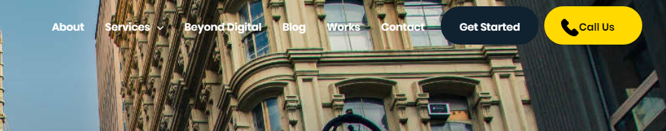
This is not an unusual request, and many themes (such as the highly recommended Astra theme) have a built-in function to add a custom Call-to-Action button as the last item in a menu. However, this particular client wanted two of them, which required some custom CSS to achieve.
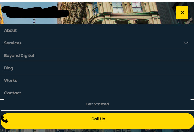
The issue is that when the screen width was reduced (such as on mobile devices) the styling was thrown off for these last two items, as per below.
I was searching in vain for a solution until I stumbled upon this article about Media Queries.
Media Queries are custom bits of CSS3 which allow you to specify display conditions on certain elements, in my case the Call to Action buttons. Here’s a quick rundown on how they work:
Max-Width Queries
@media only screen and (max-width: 600px) {…}
What this code is saying is “if device width is greater than 600 px, then do {….}”
So if you want certain elements on your page appearing only on mobile devices, you would insert their corresponding CSS code into the curly braces.
Min-Width Queries
@media only screen and (min-width: 600px) {…}
This line would execute any CSS code which is found between the curly braces, as long as the minimum width of the device was 600 pixels.
You can also combine Min and Max queries like this:
@media only screen and (max-width: 600px) and (min-width: 400px) {…}
So in my case, I wanted to disable the Call to Action buttons from displaying in my mobile menu, since the styling was messed up. So my code for my custom menu bar looked like this:
@media only screen and (min-width: 900px)  {

.menubar_getStarted {
 	border-radius: 35px;
    background-color:#102130;
    width: 140px;
    text-align: center;
    height: 55px;
    padding-bottom:4px;
    margin-left:8px;
    margin-top:-5px;
}

.menubar_callUs {
    border-radius: 35px;
 	background-color:#ffd900;
    width: 140px;
    text-align: center;
    height: 55px;
    padding-bottom:4px;
    margin-left:8px;
    color:black;
    margin-top:-5px;

}


#menu-item-541 a{
    color:black;
    background-image: url('https://staging3.websitedesignlab.ca/wp-content/uploads/2019/02/phone-outline-2.png');
		background-repeat: no-repeat;
		background-position: left;
    padding-left:25px;
}

#menu-item-541 a:hover{
    color:#ffffff;
}

}
Creating a Sticky ‘Call Us’ Button for Mobile
The other request I received from my client was to make the ‘Call Us’ button sticky so that it would always appear on the lower right of the screen as a user scrolled through the website on their mobile phones.
This is where the new version of Elementor Pro (version 2.5) comes in handy. If you haven’t heard of Elementor and you are a WordPress Web Designer, this is the time to jump on the bandwagon. It is such a powerful tool and is only getting better all the time by their dedicated team of Developers.
Elementor Pro now allows you to use the Custom Positioning feature to position an element exactly where you want it to go.
In the screenshot below, I’ve specified the button to appear in a Fixed position. Fixed Positioning allows you to specify where an element appears relative to another element, or the DOM. In this case, I’ve specified that it should appear 12 % offset from the bottom of the Viewport Height (VH) for my Vertical Orientation, and 2 % from the right edge of the Viewport Width (VW) property for my Horizontal Positioning.
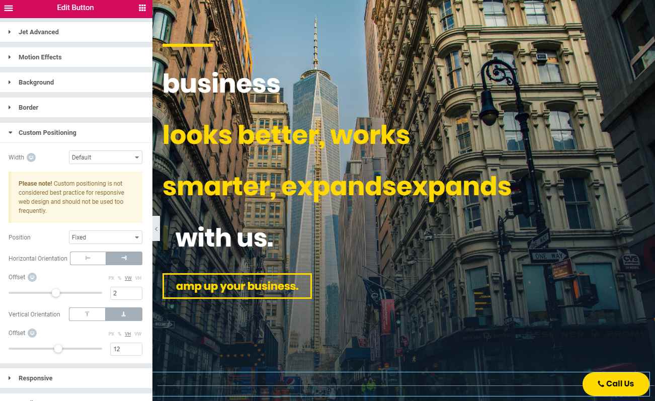
Additionally, under the Advanced > Responsive tab, I have “Hide on Desktop” and “Hide on Tablet” selectors activated.
That’s it! Now our menu is fully responsive, and our Call Us button appears to stick to the bottom of a user’s screen as they scroll our website.
Have a custom request for your website? We can definitely help you out. Check out our homepage for a showcase of some of our previous projects.
Pingback: how to buy androxal us overnight delivery
Pingback: Buy enclomiphene online overseas
Pingback: how to order rifaximin cheap from india
Pingback: xifaxan without prescription
Pingback: buy cheap staxyn purchase line
Pingback: how to order avodart buy dallas
Pingback: achat kamagra pharmacie envoyer ai
Pingback: Buy dutasteride online perscription
Pingback: purchase flexeril cyclobenzaprine price for prescription
Pingback: get gabapentin canadian pharmacy no prescription
Pingback: buy cheap fildena canadian discount pharmacy
Pingback: buy itraconazole generic when will be available
Pingback: fedex kamagra bez vězení