

HOW TO DESIGN A WEBSITE:
1. Set a Goal
2. Pick a Website Builder
3. Select a Layout
4. Choose a Domain Name
5. Gathering your Content
6. Add Pages
7. Adding Visual Styling
8. Additional Tools and Features
9. Accessibility
10. Optimizing for Mobile
11. SEO Basics
12. Visitor Engagement
13. Feedback
14. Publishing and Updating
15. Summary
In the ever-advancing landscape of technology, designing a website has become a task made accessible to everyone, thanks to the evolution of website builders. Crafting a compelling online presence is now within reach, enabling individuals and businesses to generate revenue, build communities, and promote their brands effectively. This step-by-step guide aims to provide the knowledge you need to embark on the journey of designing and creating your own website.
1. Set Your Goal
Before diving into website design, clarify your objectives. Identify the type of website that aligns with your goals and target audience, such as an online store, portfolio site, business website, blog, event platform, photography website, or restaurant page. Tailor your design choices based on your overarching purpose.
Now it’s time to start! As you start with the website design, you’ll notice that the elements you choose to include depend on your specific goals. For instance, if you aim to sell your photos online, consider showcasing them in a portfolio and incorporating an online store for print sales. On the other hand, if your objective is to create a website for job hunting, a straightforward and professionally presented resume site without unnecessary frills may be the most suitable choice.
2. Pick Your Website Builder
Now that you’ve pinpointed your goal, the next crucial step is selecting the right website builder to bring that vision to life. A website builder, also known as a CMS (Content Management System), serves as a platform where you can create, personalize, and publish a website without the need for coding expertise.
There are many options out there, and no doubt you’ve encountered some ads for them already. The three most common are Wix, Weebly, and Squarespace. After trying all three, my recommendation is… none of them!
None offer the level of customization and flexibility I was looking for, and the monthly fees were expensive. You can read more about my final recommendation and why I chose that in this blog post about how to learn web design fast.
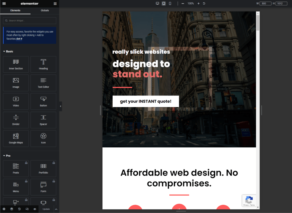
But unless you’re looking for an extremely simple website, or a one page website, I recommend WordPress, along with the free Elementor page builder.
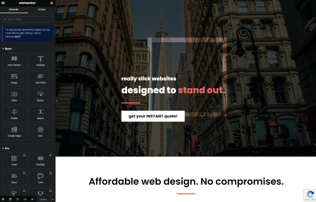
Design Customization: Elementor caters to both seasoned web designers and those still learning the ropes. The Elementor Editor, with its drag-and-drop technology and WYSIWYG software, offers complete design freedom. Each element of your website can be customized without the need for markup languages like HTML, CSS, or Javascript.
Unique Design Features: Elementor’s design features are fully customizable, allowing you to shape your website exactly as you envision it. With a plethora of options, including a range of imagery and backgrounds, as well as innovative features like transparent videos and scrolling effects, you have the flexibility to craft a unique online presence.
3. Define Your Layout
Once you’ve successfully logged into your chosen platform, the exciting phase of conceptualizing your website layout begins. If you’re inclined to build from the ground up, consider mapping out your website’s design on paper before delving into the drag-and-drop process. This will help you visualize the structure and functionality of your site, as well as identify any potential issues or gaps. Alternatively, another efficient route is to explore the realm of templates and themes – pre-designed layouts crafted by professional designers.
A theme is a great way to get a head-start on the design and layout of your website. It also provides a consistent and attractive design for your site, which can enhance your brand identity and user experience. My recommendation is the popular Astra theme, which even includes several free templates which you can import. Astra is a lightweight and customizable theme that works well with various plugins and page builders. It also offers features such as fast loading speed, SEO optimization, and responsive design.
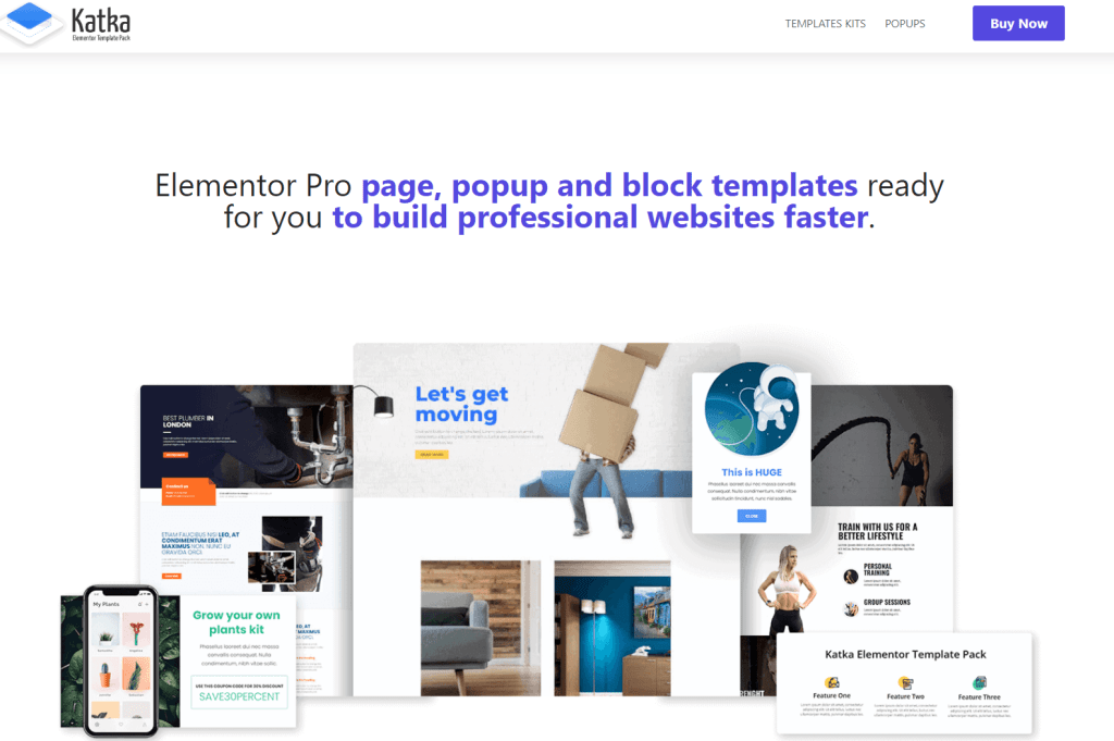
There are a few sources where you can find either paid or free templates. I like to use Katka Template Pack. Their package offers over 135 professionally designed templates. They regularly feature sales in which they reduce the price to $5 USD! So it’s a steal, and you can use them on unlimited websites.
Another good option is Envato Elements, which offers templates for both the Free and Pro versions of Elementor.
After selecting a template, you can use Elementor (or a page builder of your choice) to further customize your template. Adjusting details like text, images, and color allows you to imbue the template with your unique touch.
Within these template selection options, you’ll encounter the choice between multi-page templates and single-page ones. For content-heavy websites, a multi-page structure might be the optimal choice. On the other hand, if your content is concise and focused, exploring one-page website templates becomes an attractive option. This trendy choice finds popularity in crafting landing pages, event websites (such as wedding websites), and other platforms with short-form content.
Here’s a pro tip to elevate your web design journey: immerse yourself in creative inspiration. Explore websites that have nailed their design, jotting down ideas that resonate with you. Social media platforms like Pinterest and Dribbble are treasure troves of design inspiration, offering a vast array of visually appealing examples. Additionally, expand your design knowledge by delving into concepts such as the golden ratio and its application in effective website layout. This exploration enhances your understanding of the principles governing compelling web design, allowing you to add creativity into your project. So, grab your pen and paper, dive into the world of design inspiration, and let your web design juices flow freely.
4. Claim Your Domain Name
In straightforward terms, your domain name is your online address – the identifier that visitors see in their browser bar following the “www.” Registering your domain is a crucial step for achieving success online. Websites with a personalized domain are automatically perceived as more professional and trustworthy by internet users.
A wisely chosen domain name not only enhances the credibility of your website but also plays a pivotal role in how search engines, such as Google and Bing, interpret your online presence. This understanding is vital as it contributes to increased traffic to your website.
So, how do you go about selecting the perfect domain name for your brand? Here are some key considerations to make it memorable:
1. Keep it Simple: Avoid symbols, special characters, and numbers in your domain name. Opt for simplicity.
2. Keep it Professional: Incorporate your name or business name into the domain to avoid any confusion. This adds a professional touch to your online identity.
3. Make it Evocative: Offer a hint about your business in the domain name. Include words related to your industry to give visitors an idea of your website’s content.
To determine the availability of your desired domain name, use a reliable domain registration tool. If your preferred choice is still available, secure it promptly. If not, don’t fret – experiment with different variations or consider adding “the” at the beginning.
Choosing a TLD
TLD stands for top-level domain, which is the last part of a domain name after the final dot. For example, in amazon.com, the TLD is .com. There are two main types of TLDs: generic and country code.
Generic TLDs (gTLDs) have generic organization descriptors, such as .com for commercial, .org for organization, .net for network, etc. There are also newer gTLDs that are more descriptive, such as .blog, .shop, .online, etc.
Country code TLDs (ccTLDs) have two letters that represent a specific country or region, such as .tr for Turkey, .uk for United Kingdom, .us for United States, etc. Some ccTLDs are restricted to residents or entities of the corresponding country or region, while others are open to anyone.
The difference between gTLDs and ccTLDs is mainly based on their intended purpose and target audience. Generally speaking, gTLDs are more suitable for websites that aim to reach a global or generic audience, while ccTLDs are more suitable for websites that aim to reach a local or specific audience. However, there are exceptions and overlaps depending on the context and the popularity of the TLD.
There is no definitive answer to whether one type of TLD is better than another, as it depends on various factors such as availability, cost, branding, SEO, trust, etc. The best TLD for a website is the one that matches its goals and audience.
TLDR; It really doesn’t make a huge difference. Choose whichever TLD extension best fits with the domain name and business name and image you want to create. If you’ve chosen a perfect domain name, but it’s already taken on the “.com” extension, just pick another TLD rather than changing the domain name entirely.
Selecting a domain also involves choosing the right web hosting provider. With Website Design Lab, every site is equipped with reliable and secure web hosting as a standard feature, ensuring a seamless online experience for your visitors. Make informed choices when it comes to your domain and hosting, setting the stage for a successful online presence.
5. Gather Your Content
Now that you’ve established the foundations for your digital design, let’s delve into the practical steps of preparing the content that will grace your website. This involves curating a diverse array of web content, including images, text, logos, videos, and more.
Strive to infuse your website with as much original material as possible to ensure that your content is not only unique but also authentically branded. In instances where original content isn’t feasible, ensure that you acquire resources legally to sidestep any potential legal issues.
There are several ways to obtain free stock photos for your website. My favorite resource is Unsplash, which allows photographers to post their work. You can download the images in whatever resolution you like, as long as you credit the photographer. Another site is Pexels, which offers similar results.
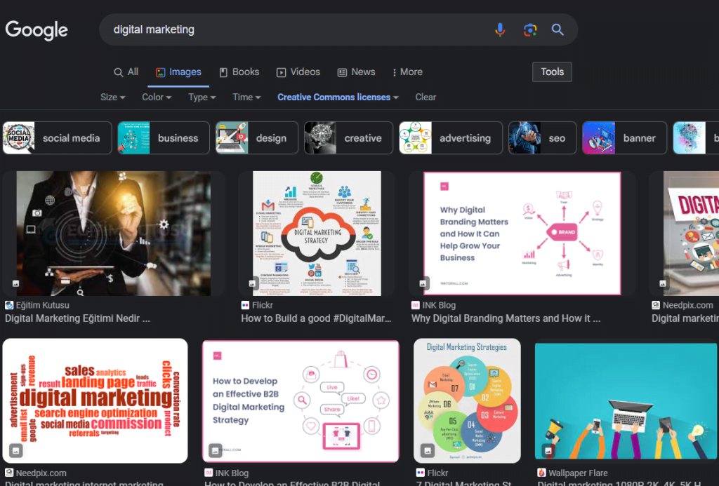
And of course, you can always use Google’s “Images” search option. Unless you want to pay for images, you should generally select the “Creative Commons” option. Images with this enabled allow you to use their work, as long as you provide credit.
Do you need some customized icons? They are a popular source of visual cues on many website designs. There are several free resources available, which you can do on a Google search. Here’s one I’ll recommend: The Noun Project.
While it’s great to have a lot of content on your website, keep in mind the golden rule: prioritize quality over quantity. In an era marked by diminishing attention spans, capturing your visitors’ attention hinges on showcasing only the very best of your content.
Take the final stride in content preparation by ensuring that every piece is fully branded. Consider your website as an online persona – from written content to the colors and fonts you use, let each element resonate with who you are or what your brand identity signifies.
Here’s a pro tip for those navigating the marketing landscape or looking to refine their brand language: explore this comprehensive guide covering everything from logo creation to defining your tone of voice. This guide provides insights into building a robust brand identity, ensuring that your online presence is authentic and resonates effectively with your target audience. Armed with these content creation strategies and branding insights, you’re poised to craft a visually appealing and authentically branded website that leaves a lasting impression.
6. Add the Pages You Need
In the vast landscape of businesses, each one possesses its unique identity, and a website, as an extension of that identity, should reflect this individuality. However, certain traditional web pages are generally expected by all site visitors. If you’re opting for a multi-page website design, consider incorporating these essential web pages:
- 1. Homepage: Your homepage serves as the virtual front door to your business. As the initial impression, aim for a clean, organized, and eye-catching design. Include crucial information such as your logo, business name, and a navigation menu. Beyond the basics, think about incorporating engaging elements like background imagery, written content, and calls-to-action to captivate and guide visitors.
- 2. About Us page: First, determine if you truly need one. Most small or medium-sized businesses can include “About” information right on the Home page. If you do decide a separate About page is needed, share the story of your business, your values, methods, and other defining information on the About Us page. Utilize a friendly tone by using the first person (“I” or “We”). Introduce your team with a photograph, providing a personal touch that resonates with visitors.
- 3. Contact page: Make it easy to get in touch with you with a dedicated contact page. Include essential contact details such as your phone number, postal address, business email, and social media accounts. Enhance accessibility with features like a live chat widget for immediate responses or a contact form integrated into your site.
- 4. Product or Service page: For businesses offering products or services, a dedicated page is essential. Enhance this page with high-quality visuals, precise descriptions, and transparent information about conditions like shipping, returns, or cancellations.
Not Essential, But Recommended:
- 5. Blog: Starting a blog not only positions you as an industry expert but also nurtures a loyal community and drives traffic to your site. Share client success stories, case studies, interviews, or insights from your own experiences to add value to your readers. I recommend to the majority of my clients to start a blog ASAP, as this is the easiest way to start driving organic traffic to your site. The more content your website has, the more “trust” it will receive from search engines, thus boosting your rankings.
- 6. Testimonials: Leverage the power of your satisfied customers by including an honest testimonials page. Studies show that positive experiences lead to recommendations, making testimonials a powerful tool for attracting new customers. Incorporate social proof examples to bolster credibility.
- 7. Splash page: Engage visitors before they reach your homepage with a splash page. This preview can feature high-quality visuals, interesting text, or promote special offers or events, creating an immediate connection and enticing visitors to make a purchase or submit contact details.
- 8. FAQ page: A dedicated Frequently Asked Questions (FAQ) page organizes and provides quick answers to common questions, offering a seamless user experience and saving time for both you and your visitors.
- 9. Privacy page: Ensure legal compliance by including a privacy policy page, particularly important if you use third-party services or monetize your site through ads. A transparent privacy policy builds trust with customers and establishes your brand as one they can rely on.
By incorporating these key web pages into your multi-page website design, you not only meet visitor expectations but also create a comprehensive and engaging online presence for your unique business.
7. Crafting Your Website’s Visual Identity
You have your content ready, secured your domain name and created your website’s pages. Now it’s time to design the elements of your website.
In this section, we’ll discuss the details that will make your website look cohesive and attractive, and how to arrange them according to your design style – whether it’s minimalist, modernist, brutalist or something else entirely. The main thing to remember is that your design should reflect your brand identity – the unique look and voice that you use to convey your message to your audience. Additionally, you should always prioritize usability: your website should make it easy for visitors to navigate and enjoy their user experience.
Here are some elements to consider when learning how to design a website:
Website architecture: To ensure that visitors have a smooth website navigation experience, your pages need to be well connected to each other. Make it easy for visitors to find the pages they want by adding a navigation menu and using internal links. A good rule of thumb is the “two-click rule:” Your visitors should be able to access any page of your site with no more than one click, no matter where they are.
Menu: This essential element of your design will show the different items that your website offers, and help visitors move from one page to another. Website menus can vary from the standard horizontal header menu, to the compact hamburger menu. Whatever style you choose, it’s advisable to make it visible on every page of your site, and to keep the number of items low to avoid cluttering the screen.
Another strategy you may see employed is what’s called a “sticky header”. This is a feature of most WordPress themes that allows your site’s header to ‘stick’ to the top of the screen as a user scrolls down the page. This allows you to keep important page navigation and feature buttons always accessible to your users.

Color Selection
The psychology of color shows that different shades can evoke different feelings and associations in your visitors. For example, red can convey passion, urgency, or danger, while blue can convey trust, calmness, or professionalism. Believe it or not, your choice of colors makes a huge first impression to your website visitors and can impact your site’s bounce rate.
A good way to create a harmonious color scheme is to use the 60-30-10 rule: use one main color for 60% of your website, one secondary color for 30%, and one accent color for 10%. These colors should complement each other and create contrast and balance. If you already have established brand colors, you should use them on your website as well.
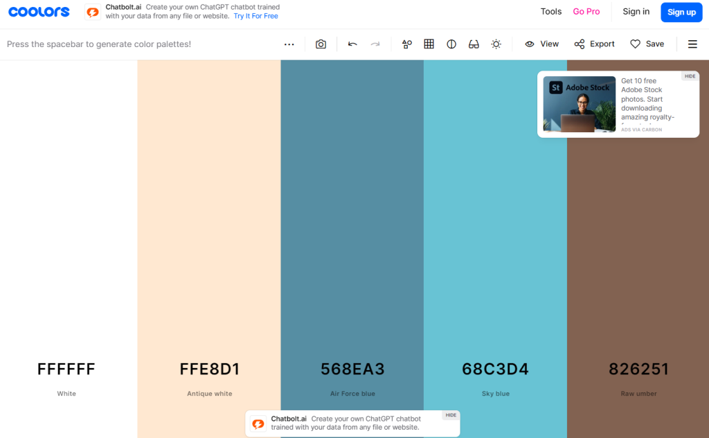
To take the guesswork out of choosing complementary colors, or if you don’t have a Visual Arts major, a great resource, which I often use as well in my website designs, is Coolors. This free resource automatically selects a complementary color palette for you, based on one or two main color themes which you can specify. It also offers pre-selected palettes to choose from as well.
You also need to be aware of the concepts of web colors and color space, which refer to how colors are represented and displayed on different devices and browsers. You want to make sure that your colors look consistent and accurate across different platforms.
How to Select Your Fonts
The fonts you use on your website can affect how easy it is for your visitors to read and understand your content. You also want to choose fonts that reflect your brand personality and style. For example, serif fonts can convey elegance, tradition, or authority, while sans serif fonts can convey modernity, simplicity, or friendliness.
When choosing fonts for your website, you should limit yourself to a maximum of three fonts: one for headings, one for body text, and one for accents. These fonts should work well together and create a clear hierarchy of information. You should also make sure that your fonts are legible on both desktop and mobile devices.
I recommend using Google Fonts for this purpose. With an almost endless supply of free fonts, it makes it easy to pair different fonts together and get a visual idea of how they will look on your website.
Header & footer
Your website’s header and footer are the elements that appear at the top and bottom of every page of your website. They play an important role in enhancing the usability and engagement of your website. They can also help you establish your brand identity and credibility.
Your header is the first thing that your visitors see when they land on your website. It should include features that help them find what they are looking for quickly and easily, such as your logo or navigation menu. Your logo should be clear and recognizable, and your navigation menu should be simple and intuitive.
Your footer is the last thing that your visitors see before they leave your website. It should include features that help them stay in touch with you or learn more about you, such as your contact information, social media buttons, or email sign up form. Your contact information should be complete and accurate, your social media buttons should link to your active profiles, and your email sign up form should be enticing and easy to use.
Motion
Motion is one of the most effective ways to attract and engage your website visitors. It refers to any dynamic, multimedia element that you can add to your website, such as animations, hover effects, video backgrounds and more. Motion can create a sense of interactivity, excitement and professionalism on your website, but it should also be used with care and purpose.
Additionally, consider the impact that many motion effects will have on your webpage speed. These animations (and especially video backgrounds) take much more time to render (or load) for visitors than simpler HTML code.
Scroll Effects
One of the most popular types of motion is scroll effects. These are animations that appear or change as the visitors scroll up or down your site. Scroll effects can create a smooth and seamless transition between the different sections of your website, as well as add a 3D effect that makes your site more immersive and dynamic. For example, you can use parallax scrolling to make your background images move at a different speed than your foreground content, creating a sense of depth and movement.
You can also use other scroll effects, such as reveal or zoom-in, to highlight important information or features on your site. You can easily add scroll effects to your website using Elementor’s basic background, or image widget.
Here’s a helpful article on Wix which goes into a pretty in-depth explanation of parallax scrolling and some websites that feature it.
Favicon
A favicon is a small icon that represents your website in the browser tab. It helps users identify and locate your website among multiple tabs, as well as reinforces your brand identity by displaying your logo in another place. A favicon also adds a touch of professionalism and credibility to your website, as it shows that you pay attention to the details and care about your online presence. Uploading a favicon is very simple with WordPress, and there are many guides you can search for online.
Pro Tip: For a favicon, which would usually be your company logo, keep in mind that it looks best on a transparent background. There are several free tools to help you achieve this visual effect, one of which is remove.bg.
Responsive Design
In today’s digital world, people access the internet from a variety of devices, such as desktop computers, tablets, and mobile phones. Each device has a different screen size and resolution, which can affect how your website looks and functions. Responsive design is a technique that allows your website to adapt to the device that your visitors are using, by automatically adjusting and stacking the layout and content of your pages. This way, you can ensure that your website provides a seamless and consistent browsing experience for everyone, regardless of the device they use.
Whitespace
When you design a website, you might be tempted to fill every inch of the screen with images, text, or other elements. However, this can make your website look cluttered and overwhelming, and reduce its readability and usability. Whitespace, also known as negative space, is the area of your website that doesn’t contain anything. It doesn’t have to be white; it can be any color or background that creates contrast with the rest of the page. Whitespace is not wasted space; it is a powerful design tool that can help you create a clean, elegant, and user-friendly website. Whitespace can help you achieve balance and harmony in your design, draw attention to the most important elements on your page, and give your visitors room to “breathe” between different pieces of content. It can also help you avoid the paradox of choice, which states that the more options people have, the harder it is for them to make a decision. You don’t want to confuse or frustrate your visitors with too many choices; you want to guide them to interact and navigate your website with ease.
Pro tip: If you want to learn how to design a website that is aesthetically pleasing and effective, you can take inspiration from some of the masters of art and design throughout history. Many of the principles of design that have been used for centuries in painting, sculpture, architecture, and other forms of visual art can also be applied to web design. For example, you can use balance to create a sense of stability and order in your layout; symmetry to create a sense of harmony and proportion in your elements; contrast to create a sense of drama and emphasis in your colors, fonts, or images; hierarchy to create a sense of importance and direction in your content; alignment to create a sense of unity and organization in your page; repetition to create a sense of consistency and rhythm in your design; and so on.
08. Selecting a Professional Toolset
The internet is not only a source of information and entertainment, but also a thriving marketplace where millions of people buy and sell products and services every day. According to a report by Statista, the number of online shoppers is expected to reach 2.14 billion by 2022, which is more than a quarter of the world’s population. If you want to tap into this huge potential market, you need to have a website that can handle online transactions efficiently and securely. You also need to have a website that reflects your brand identity and showcases your unique value proposition.
Online store options
If you have physical or digital products to sell, such as clothing, accessories, books or courses, you need an online store that can showcase your products, process orders and payments, and manage inventory and shipping. WordPress’ free WooCommerce plugin gives you everything you need to run a successful e-commerce business, from creating stunning product pages and collections to accepting payments with multiple providers, to tracking your orders and analytics.
The most popular payment processing services are provided by Stripe and Square. WooCommerce makes it easy to add these payment providers to your E-Commerce store via an API key that you can obtain after creating an account. Both these providers charge a nominal fee for credit card processing (as any credit card company would do).
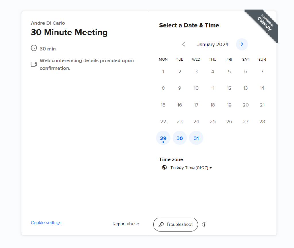
Scheduling software for WordPress
If you offer services that require appointments, such as consulting, coaching, tutoring or fitness training, you need a way to let your clients book and pay for your services online, at any time of the day or night.
There are several great options here. One of the most popular plugins is called Calendly, and they offer free plans, and some great functionality right out of the box.
Best Online Calculator Plugin
An online calculator is a great addition to your WordPress website for several reasons. First, it can help you attract more visitors who are looking for a quick and easy way to solve their problems or get an estimate. Second, it can increase your conversion rate by providing a clear value proposition and a call to action. Third, it can enhance your credibility and authority by demonstrating your expertise and knowledge in your nichthe.
Here are two recommendations for adding an online calculator to your WordPress website. One, use a plugin that allows you to create and customize your own calculator with drag and drop features and various templates. Two, optimize your calculator for SEO by adding relevant keywords, meta tags, and schema markup to improve your ranking and visibility.
Pro Tip: My personal favorite is Jotform. It features a slick and easy to use interface, and each calculator can be embedded directly into your website via a shortcode. It also offers free plans for up to 100 form submissions per month.
Social posts: If you want to increase your brand awareness and drive more traffic to your website, you need to leverage the power of social media platforms such as Facebook and Instagram. There are several plugin options to add an Instagram widget directly to the Elementor interface. Here’s a list of the top 11 plugins for adding an Instagram feed to your WordPress website.
Best Live Chat Plugin
A live chat app on your WordPress website can help you boost your customer satisfaction, sales, and loyalty. By enabling real-time communication with your visitors, you can answer their questions, solve their problems, and guide them through your products or services. A live chat app can also reduce your operational costs, as you can handle multiple chats at once and automate some of the responses. With a live chat app on your website, you can create a more engaging and personalized experience for your customers, and stand out from your competitors.
My recommendation: Tawk.to, which offers plenty of advanced features for free. If you want to remove the Tawk.to branding, you’ll need to upgrade to a paid plan.
Explore: There are over 58,000 WordPress plugins! I recommend taking some time to explore these, as there’s bound to be a few that can enhance your site’s functionality or offer some compelling features.
09. Ensuring Accessibility for All
A good website design is not only visually appealing, but also accessible to everyone, regardless of their abilities. Web accessibility means that people with different kinds of disabilities, such as vision impairment, temporary injuries, hearing loss and more, can easily access and interact with your website. This is important because there are over one billion people in the world who have some form of disability, and they deserve to have a positive and inclusive online experience. It also reflects well on you and your business, as it shows that you care about diversity and inclusion.
To make your website more user-friendly for everyone, you should follow some best practices for web accessibility. For example, you should organize your website content in a logical and hierarchical way, using clear headers to mark the different sections and levels of information. You should also make sure that your website can be fully navigated with a keypad, without requiring a mouse or a touch screen. Furthermore, you should write alt text for your images, which are descriptive texts that explain what the images show or mean. Alt text helps people who use screen readers or have low vision to understand your images. You should also use heading tags, which are HTML tags that indicate the structure and importance of your headings. Heading tags help people who use assistive technologies to scan and navigate your website content more easily.
Pro tip: AccessibilityChecker is a free tool which is offered by a nonprofit organization dedicated to ensuring that the web can be freely navigated by all, regardless of their limitations. You just need to type in your URL, and it will analyze your website and provide recommendations.
10. Optimizing for Mobile
Mobile devices may have smaller screens, but they can still make a huge impact on your online presence. As more and more people use smartphones and tablets to browse the web, you need to ensure that your website design is responsive and adapts to different screen sizes.
Most WordPress themes include a mobile version of the webpages as standard, however you likely will need to make some tweaks and adjustments. Elementor features a ‘responsive mode’ which allows you to select which layout you want to view your site in: Desktop, Tablet, or Mobile. You can easily switch between each and make any adjustments necessary for each view.
One of the best practices for mobile website design is to simplify your layout and keep only the essential elements on the page. This will help your site load faster and avoid cluttering the screen. Another tip is to optimize the space above the fold, which is the first thing your visitors will see when they open your site on a mobile browser. Make sure to put the most important information there, such as your menu, logo or headline. This will capture their attention and encourage them to explore more.
Another tip is to eliminate or reduce unnecessary animations and motion effects on the mobile view. This will help speed up the page loading time, as smartphone users tend to be a bit more impatient waiting for web pages to load.
11. Strengthening SEO Practices
There is nothing more rewarding than seeing your website attract more and more visitors. To achieve this, you need to create a website design that follows SEO best practices. SEO (search engine optimization) is the process of improving your website’s content so that it appears higher in search results.
SEO is not a quick fix, but a long-term strategy that requires time, patience and persistence. However, you can start implementing SEO techniques as you design your website. Here are some SEO tips that you can use to optimize your content and boost your ranking potential:
Conduct keyword research
Keyword research will help you identify the keywords that are most relevant for your site and your target audience. You should choose one main keyword, and a few secondary ones – but don’t go overboard. You should use your keywords in strategic places on your site (SEO title and description, homepage, etc.), but don’t overuse them. Search engines can detect when websites “stuff” keywords artificially into their content and penalize them accordingly.
Include on-page SEO
This is about informing search engines what your pages are about. On each page, your website builder will ask you to fill in the meta-data. This includes the URL, the SEO title (the blue link you see on Google’s results page) and the description. These elements may not be visible to your visitors, but they are crucial for ranking.
Add alt text
Alt text refers to the descriptions that you give to your images. These won’t be visible to your visitors either, but they give a clear signal to Google about what the media is about. Google may be smart, but it can’t “see” photos or GIFs (yet!). Alt text will help your visual content show up in Google results pages. Moreover, writing SEO friendly alt text for your images is also an important practice to improve your website’s accessibility.
Enhance internal linking
This will improve the user experience and the site structure, making it easier for Google’s bots to crawl and index your website. By adding relevant links throughout your website design, you can also increase the dwell time and engagement of your visitors, as they will be able to explore more pages on your site. This practice is also referred to as ‘siloing’ your content.
Generate a sitemap
This will help Google and other search engines to understand the hierarchy and content of your site. A sitemap is a file that lists all the pages on your site and how they are connected. You can submit your sitemap to Google Search Console to make sure that your site is properly indexed. Most free SEO plugins for WordPress, such as All-In-One SEO, include an automatic feature to create your sitemaps.
Pro tip: You can regularly track the growth of your web traffic and performance of your site by connecting your website to tracking tools, like Google Analytics or Google Search Console.
12. Engaging with Visitors
Nowadays, visitors want to interact with you not only on your website, but also on other platforms. To design a website that meets their expectations and keeps them engaged, you should consider adding some of the following features. By connecting with your followers through multiple channels, you can strengthen your relationships with them and attract more visitors to your site.
Live chat: A live chat widget is a simple yet effective feature that can enhance your visitors’ experience on your website. With a live chat, you can offer instant customer support or guide potential buyers to complete their purchases. This small window at the bottom of your users’ screen is a welcoming and helpful addition.
Social media: Your social media channels are another essential part of your online presence, just like your website. When you design your website, make sure to include links to your social accounts so that visitors can follow you and stay updated on your latest news and activities. These links should be placed in a prominent location, such as under the menu, on the right or left side of your page, or in the footer.
Newsletter: Email marketing is an excellent way to maintain a connection with your audience. You can use email newsletters to inform visitors about the latest deals on your online store, promote new blog articles, or share your achievements with subscribers. To grow your email list, you can display a lightbox on your website that invites visitors to sign up for your newsletter.
Forms: One powerful way to build long-lasting relationships with your customers is to ask for their feedback. Creating an online form for your website allows you to collect valuable insights from your visitors about your products, services, website or customer support. An online form provides a safe and convenient way for visitors to share their opinions and suggestions with you.
13. Honest Feedback
You have learned how to design a website successfully, but you can always improve your skills. One of the most challenging aspects of web design is being objective about your own work, which is why you need to seek honest feedback from people you trust.
Be open to their suggestions, and don’t take their criticism personally. You may not agree with everything they say, but it will help you polish your website. Before you launch your site, ask a friend or colleague to check the following elements:
Is the text correct? Spelling and grammar errors can damage the professional image that you have worked hard to create.
Are the pages easy to navigate? If your visitors struggle to find what they are looking for, they may leave your site quickly. You may need to simplify your site structure or make your menu more visible.
Is your web design optimized for mobile? More than half of the internet users access websites from their mobile devices. You don’t want to frustrate them with a poor user experience.
Are all the links working? Test every link on your site to make sure none of them leads to a 404 page (this means that the page no longer exists). Also, make sure that your call-to-actions (CTA’s) have the right links and direct your visitors to the desired pages.
Are the SEO elements filled out correctly? There are some details that you need to pay attention to if you want to rank higher and increase your search engine visibility. These include alt text for images, title tags for pages, meta descriptions for snippets, and keywords for content.
14. Publishing and Updating
A website is not just a nice-to-have, it’s a must-have. But having a website that is outdated or stale can do more harm than good. A website that looks neglected or abandoned can deter potential customers and damage your reputation. That’s why you need to be proactive, informed, and ready to update or redesign your website’s content regularly.
Updating your website is not a one-time task, it’s an ongoing process. You need to constantly monitor your website’s performance, usability, and appearance, and make adjustments as needed. You also need to stay on top of the latest web design trends and UX design trends, and use them to enhance your website’s design over time. And don’t forget about your content: it should always be relevant, engaging, and up-to-date with the latest developments in your industry.
What You Need to Design a Website (Summary):
- A domain name.
- Web hosting.
- A website builder or CMS like Wix.
- Design assets (images, videos, fonts).
Factors to Keep in Mind During Design:
- Clear understanding of your website’s purpose and target audience.
- Strong understanding of your brand.
- Well-defined website structure.
- Responsive design and accessibility.
- Prioritization of user experience and visually appealing design.
- Attention to website security.
When to Design Yourself or Hire a Web Designer:
Consider your budget, time commitment, skills, and experience.
FAQ – Designing a Website
How Much Does It Cost to Design a Website?
Costs vary; most large firms charge thousands of dollars for a basic website. You can get started yourself for free using many of the free tools provided by WordPress, such as the ones mentioned in this article.
How Long Does it Take to Design a Website?
It depends. If you’re learning it yourself for the first time, allow yourself a few months to do your research, and get familiar with the various tools and platforms that are available to you. There are so many options right now that you should take your time with this step.
If you would rather have a professional do it, you can search for agencies near you, or navigate to our Contact page to speak to us directly for a free quote.
How do you design a website from scratch?
- Start with a Vision: Designing a website from scratch requires careful planning and research. You should start by defining the purpose, audience, and goals of your website.
- Learn: Then, you should research the latest website design trends, as well as the needs and preferences of your audience.
- Choose your Tools: Next, you should choose the right tools for your website. You can use a free website builder like Wix to create a basic website. However, if you want more features and flexibility, you will need to pay for a premium plan.
4. Start Designing: After that, you can start designing your website. This is where you will create the visual appearance and functionality of your website. You should use your research and plan as a guide for your design decisions.
5. Optimize: Finally, you should test and refine your website. You should make sure that your website works well on different devices and browsers. You should also ask for feedback from your audience and improve your design accordingly.